Wednesday, October 30, 2013

Spooky

It's Halloween, everyone's entitled to one good scare.
Congratulations to the bears for finally giving the bulls a bit of a scare just before Halloween no doubt.  Lots of interesting things to observe today so lets start with our SPX 15min PnF chart once again to highlight our 1757.8 and 1764.6 support and resistance areas that we spoke about in our previous post.   To continue with our trade example we would have been stopped out today since price broke below the 1764.8 support which served as the stop loss trigger.  You will also notice that price hit support 1757.24 (shorting after the FOMC meeting) before rallying right back into 1764.6 area of resistance.  As you can see the 1757.24 area is becoming more and more significant.

The SPX 5 min candlestick chart shows the price action today around those areas of support and resistance.   You will also notice that as price hit an all time high earlier on in the day it appeared as distribution with the high volume associated with those price levels.  This is looking more and more bearish as supply appears to be entering the market as last.  

Switching to the SPX daily candlestick chart there are a number of bearish factors about today's session. First we had the largest price range in two weeks with price hitting an all time high only to close near the low of the range.  Second, volume increased slightly today (more so on the SPY) which indicates that supply is coming into the market.   However, we still have our 1757 area of support which is growing in importance so as long as price remains about that level the bulls are safe for another day.  However, if we do break support then you can with a certain level of confidence consider a short position and look for the next level of support.  Enjoy your Halloween!

Thanks for reading.


Tuesday, October 29, 2013

I'm making money! Sell! Sell! Sell!

If you followed my break test enter trade setup I spoke about a couple of posts back you would be in a profit right now.  So what do most people do when they are in a profitable position?  Here are the top three strategies executed by the befuddled trader when in a profitable position.

1- Sell way too early.  
Reason:  I believe there is an innate desire to prove oneself as correct so either they ignore the exit strategy they have as part of their trading plan or don't have an exit strategy to being with.

2 - Wait for unrealistic profits.
Reason:  Traders are greedy and besides they need a double or triple on this position to make up for all their other losses.

3- Watch a profitable position turn into a loser. 
Reason:  This is directly related to strategy number 2 above.  Greed turns to hope which turns to a losing position which turns to frustration which leads to even more bad trading decisions.

So what is the right way to manage a profitable position?  The correct answer is to have an exit strategy that you will stick to each and every time.  Everyone wants to sell at the top and buy at the bottom.  As you saw with the break test and enter trade setup up we didn't necessarily buy at the bottom we waited for a break above a previous high to get into the trade shortly after support held.  Therefore the reverse would be true for exiting.  Look to see where the next resistance level is and wait to see if that level is holding and sell on a break of the previous low.   However, if price is progressing upward raise your stop loss (which you should have by the way) at each new support level.

The SPX 15min candlestick chart below highlights where we would have entered the trade and placed our initial stop loss and where we have moved our stop as price continued to rally. With all new positions the stop loss is used to limit losses just in case the market goes against shortly after placing your trade.  Raising of the stop is to protect profits.  Simple plan no?
How do we know which level to raise our stop loss?  Let's pull out our ole' dependable SPX PnF 15min chart (the same one that got us in the trade) and see if we can identify where a previous level of resistance was broken.  You can see that 1764.6 was previous resistance before prices move down slight then was broken as prices rallied.  So that is the only logical place I would raise my stop loss to protect profits.   If stopped out the profit would not be huge but still allows the trade room to move.  More importantly we are managing our trade and risk in a consistent way.  So as price continues to move to nose bleed levels and as more and more people are pounding the table calling for a correction (and some calling for a crash) we stay the course and trade what we see not what we hope.

Thanks for reading.


Monday, October 28, 2013

Remember Break Test Enter?

A few months ago I spoke about a trade setup called break test and enter that I execute on frequently.  The sequence is as follows:

Break - Pre-defined level of support and resistance (S/R) has been broken
Test - The broken level of S/R is tested confirming previous support as resistance or vice versus
Enter - Enter the trade only after the price bar closes above/below the high/low of the test bar. 

Today we saw another intraday example of the break test enter trade setup.   Below is the SPX 15min PnF that we have been using for the past little while to determine the area of demand and supply at these nose bleed levels highlighting the 1757.8 level.

Below is the SPX 15min candlestick chart demonstrating the trade set up.  Price broke above the resistance level of 1757.8 yesterday to close on the highs. That is the break in our 3 step trade set up.   Today we tested the breakout level of 1757.8. That is our test step.  Then we broke higher crossing the high of the day.  That would have been the safest place to enter a long position although buying at support with a tight stop could also be an alternative but may lead to higher incidents of getting stopped out if you are not careful.  That is the enter step.  Simple no?  Again we are using a 15min chart with a 1.7 point box size.  A step on the daily PnF with a 15 point box size would obviously lead to bigger gains (and losses too).  That will be all today.  Watch for this reliable setup in your trading.

Thanks for reading.


Sunday, October 27, 2013

Breakout?

I'll make this short with some interesting observations that right now are nothing more than a theory until I can spend more time looking at the historical evidence.  Below is a 15min PnF of the SPX which shows a break of the 1757.8 resistance.  Keep in mind this is a 15 min chart with a box size of 1.7 points on a 1750+ index that fluctuates on average 15+ points daily.  We use this timeframe  because the SPX is trading at all time highs therefore using a daily or even 60 minute timeframe will not be as helpful to investigate the battle of supply and demand due to the limited trading activity that has taken place at these levels.

I've highlighted the trading ranges (green boxes) that we have spoke about in the past several posts.  I've concluded that trading ranges are simply areas of accumulation/distribution before a larger move ensues.  Once you have identified the trading range upper (resistance) and lower (support) limits all one has to do is wait for a break in that direction to jump on for the ride.   This current move higher started with a break of the trading range from 1747 - 1741 where price quickly made its way to the next level of resistance at 1757.  What I'm finding interesting is the volume profile on these trading ranges.  What I've noticed for the past two break outs to the upside is the majority of the volume was transacted at the lower end of the range (support) prior to the break out to higher prices.  What I'm theorizing is that during a trading range that is representing an accumulation phase that demand is greater support (lower end) then the supply at resistance (upper end) allowing prices to easily break higher.  If this is true then the reverse should be true for a distribution phase.  That is what I would like to investigate further.  I'll keep you posted.


For all those calling for a top I don't see anything right now to suggest a bearish move. That would be anticipating a move that really has no evidence except for a number of hunches and gut feelings and the wonder of how much higher can this market move.   The daily candlestick chart shows another bullish close with price ending on the highs of the day indicating demand is still present.  Will there be a correction?  Of course there will be I just don't see anything on either chart (PnF or candlestick) that will tell me its happening tomorrow.  However, I'm  sure some Elliot Wave theorist might point out that we have now rallied approximately the same amount as the the end of August to late September rally of ~100 points.  So I guess we have to correct now?  Lets watch and see.

Thanks for reading.


Wednesday, October 23, 2013

Back in the range

Arrogance - an insulting way of thinking or behaving that comes from believing that you are better, smarter, or more important than other people
That my friends sums up the majority of the market participants.  If you are insulted by this then you are probably losing at the trading game.  More recently I had someone ask me about a specific stock that they were thinking of buying that same day after a nasty earnings drop.  The stock at the time was trading at the lows of the day on big volume and  asked the silly question 'Why do you want to buy it now?'.  I guess a silly question deserves a silly response because the answer was 'I think it will go up now'.  Duh! Why didn't I think of that.  Believing that just because you decided to buy a stock where the share price is dropping precipitously will just stop and reverse immediately based on the sound analysis of hope or gut feel is just plain arrogant.  Nonetheless you learn quite a bit talking to other market participants successful or not.

Enough of my rant on with the markets. Again we begin with the same SPX 15 min PnF chart we used in yesterdays post.  You can now see after today's session why high volume areas of accumulation/distribution or what others may call a trading range are important in determining support and resistance.  To recap what happened today the SPX dropped to back into the trading range between 1747-1741 ( I admit I did say 1745-1741 so please forgive me).   It actually dropped to the low end of the trading range to 1740.5 before bouncing still closing within the range.


So we have our lines in the sand.  The break of the upper or lower (orange lines) ends of this price range will dictate the next direction and most likely move to the next level of support or resistance (blue lines).

Thanks for reading.


Tuesday, October 22, 2013

Progress

Looks like we broke to the upside from the range of 1745-1741 we identified yesterday and again traded into uncharted territory.  What I've found absolutely hilarious is how everyone has a 'proprietary' technical indicator that is flashing (so dramatic) that market is extremely overbought! However, they fail to tell you that they have been flashing this for weeks.  Of course they are going to be right this time or eventually restoring the confidence in those indicators once again!  I do admit that in my earlier days learning the art of trading that I've come across some very appealing indicators and actually coded a few of my own that I was sure were going to be the holy grail.  Then I realized that I wasn't that smart so I scrapped indicators all together and took another approach to analyzing the market which you are reading in these endless pages of rhetoric.  

So on with the point of today's post.  Below is the SPX 15 min PnF chart where you can see how the volume profile is progressing nicely specifically at these trading ranges which represent areas of accumulation/distribution.  These areas of accumulation/distribution later serve as support and resistance which is why they are important to highlight. 


There was quite a bit of happening under the hood today.  The SPX 15min chart below highlights the support and resistance areas pulled for the PnF chart above (1757.8, 1747.6).  Price broke through minor resistance at 1747.6 only to retest it early on and rally for the rest of the day until price hit intraday resistance and pulled back into the close.   Now facts are facts and the volume profile above highlighted the areas of potential support (1745-1740, 1720-1715) therefore, should the market decide to pull back from these historic highs then lets watch these levels and see how price reacts. 

Thanks for reading.


Monday, October 21, 2013

The Art of Trading

This is such a great title!  I googled it and found that there is actually a website and a book with the same title.  I guess I'm just hoping that if anyone searching for the art of trading will lead them to my blog by accident.

So are we overbought yet?  I hate that term overbought and I'll leave it at that.  We are once again at all time highs on many of the indices specifically the SPX.  Therefore, since we have no price history at these current price levels we look at price and volume at the lower timeframes to look for clues as to where the battle of supply and demand may develop. 

The SPX 15min PnF chart below highlights the range of 1745-1741 and 1721-1715.  Also notice that 1744 had the highest volume transacted for this period.  Is this accumulation or distribution?  We will not know until the range is broken.  Just remember that this is a 15min chart covering a period of two weeks and we looking at these lower timeframes to see the beginnings of a potential larger move in a area that has no previous price history.    

Here is the SPX 15min candlestick chart with the areas we mentioned above. You can see the volume by price confirms the high volume occurring at the highs. 


Below is the SPX daily candlestick chart highlighting that daily prices have been closing on highs on on increased volume which has been clearly bullish for the markets.  Doesn't the market usually move 100pts in under two weeks of trading?   Today's action did see a slight crack in the bullish action.  We had a narrow trading range with a decrease in volume with price closing near the middle of its range.  But why guess where the market is going.  Why not just react according to the breakout of the range of 1745-1741 we highlight above  I'll be watching closely to see if we are topping or ready for another move higher. 

Thanks for reading. 


Wednesday, October 16, 2013

Comparison

Last time we mentioned that up was the path of least resistance highlighting that although the market was moving up on decreasing volume that supply wasn't really entering the market.  That looked like it was changing yesterday when the markets dropped on an increase in volume.  However, the key was to know that 1697.2 was a previous area of support and resistance that was developing almost two months ago.  Don't believe me then read it here.  Alternatively, you can just look at the PnF charts below.  Understanding that 1697.2 was a potential area of support one could of waited to see if it broke before deciding to sell any existing long positions or even initiating a new long position if the level held.  Well the support level held and the US Congress came to the rescue to with a deal to address the debt ceiling.  Markets rallied as one would expect and headed to the only remaining area of potential supply at 1719.9.   


The PnF charts below highlights the 1719.9 (to 1723.6) potential supply area.   I posted a comparison of the the two charts from Oct 14 to Oct 16.  I kept the box size the same to show how the volume profile is developing as it is a good lesson in looking at supply and demand at key support and resistance levels.   

1719.9 area is currently resistance but looking at the daily picture you can see that today's price action was decisively bullish with price closing on its highs (again) and with volume increasing.   The market looks to have its sights set on new highs but first things first and 1719.9 area needs to be overcome.  Should be interesting. 

Thanks for reading. 


Monday, October 14, 2013

Understand your own

I've read plenty of books on trading in search of the holy grail.  I've joined plenty of newsletters to rid myself of accountability when a trade went bad but accepted all the accolades when the trade went well.  Unfortunately, I cannot say that I've ever truly understood the trading methodologies that came with paying $99/month for 5-10 recommendation.  Nor can I say I've ever made money following them.  Then it hit me that following the opinions of others is not learning.  Understanding is learning.  What I've learnt is that without the understanding of the principles of any trading system you will never have the confidence in that system to successfully execute on it.

The principles of the trading system I use today are not my own (obviously).  However, they made enough sense to me to investigate them further and to come up with my own understanding and interpretation to gain the confidence to execute on them.   The funny thing is that I disagree with the majority of people's understanding of these principles which intrigued me more to continue with my own studies of these principles.  That is what this blog is all about.  The evolution of my understanding of the principles of supply and demand, support and resistance.   Lucky for you, you all have a front row seat to watch me blossom into the successful trader you all want to be one day.

Moving right along with the markets.  I've copied below the PnF chart from my last post highlighting once again the importance of the 1692.5 and 1685 area.  Why?  If you keep these numbers drawn on a chart you will see how price tends to gravitate to these area before a larger move ensues.


To hammer home the point, below is a SPX 15 min chart of the last three trading days.  You will see how price reacted to the levels mentioned above highlighting the principles of supply and demand and support and resistance.


So now what? Below we have the SPX 30min PnF chart with a volume by price overlay. You can see that although price did stop at the previous high back on August 2nd the amount of overhead supply is pretty slim until we get to 1719.9 where can see more potential overhead supply.   I am not saying that price is going to trade up to 1719.9 and reverse.  What I am saying is that moving higher is the path of least resistance for now.


Looking at the daily chart below you may notice that price has been closing on the highs for the day on decreasing volume.  I interpret this as a lack of supply allowing prices to move higher on minimal demand.  This may be explained by the recent shakeout I believe we saw (and posted about) where those holding positions in the 1684-1692 area of supply sold (out of frustration) essentially removing themselves out of the supply equation paving the way for uncontested higher prices.  If this is simply a lack of supply then when will supply enter the market?  I believe it will emerge when the large institutions decide to unload their shares to the less informed market participants. Maybe they may use news as a way to stir up enough excitement to coerce people into buying their shares.  Isn't there a debt ceiling problem to be solved?

Thanks for reading


Thursday, October 10, 2013

Regret

I'd rather regret the things I've done than regret the things I haven't done.
Lucille Ball
Most people in trading always find themselves regretting not selling at the highs or buying at the lows.  Not because that is what they planned to do at that moment, since most don't have an trading plan to begin with, but because hindsight trading is always perfectly accurate.   I like to limit the amount of my regretful trades by being consistent in my rationale to enter and exit a trade.  If you are consistent and you are profitable then you have a proper trading system if its not profitable then maybe the trading system sucks.  Not been consistent is just gambling and guess work.

The SPX 30min PnF chart below taken from yesterdays closes highlights the area of 1685 and 1692.5.  Now I am not saying I knew the market was going to explode higher today and close at 1692 (which is also the 20dma).  However, knowing where these areas of support and resistance are in advance might help remove some of the guess work of where to buy and sell.


The following chart highlights the volume profile at support and resistance and as we expect volume increases at these key inflection points. We see how volume increased at support of (1653) which indicated demand was present based on yesterdays close.  We now rallied back to resistance and have enter a high volume area. The next day or two will dictate if the market will be challenging new highs once again.

Thanks for reading.


Wednesday, October 9, 2013

Fool me once shame on you...

..fool me twice..I'm an even bigger fool!

Human emotions is what make up the behavior of our markets.  Traders and investors have all felt the same emotions at one point in their trading lives unless of course you are a sociopath.  Fear, greed, hope, desperation, euphoria, regret just to name the most common.   It is only when we acknowledge that we all non-psycho individuals can and will fall victim to these emotions while trading that we can truly beginning to take steps to control this emotions.  Additional, understanding that these emotions are felt by all of us we can use this to make better investment decisions at critical psychological areas (support and resistance) of the market.  It's the ole adage of understanding yourself to better understand others.  This I believe is one of the key characteristics of any successful trader.  They don't lie to themselves instead they look to how they can better themselves or take precautions to mitigate the risks posed by their own emotional trading imperfections. 

So where am I taking this?  I have spoke emphatically about the distribution area on the SPX between 1684-92 back in July/August that resulted in a decent pullback by the end of August.   Then as the market approached this level again in early September we mentioned that it would be difficult for the large players to buy their way through this area of large supply.  So instead they decided to leap frog over this area using the euphoria of FOMC decision to not taper the free money press known as QE.  This helped to gap the market above this supply area. That gave hope to those holding these positions since July/August that they will finally see a profit. Unfortunately, this was just a tactic used by the big boys to unload their positions willy nilly to the hopeful (a.k.a dumb) hoping that the market will continue to see higher highs ad infinitum.   Instead the market made its way back down from those all time highs and back into this area of supply striking fear into the hearts of the bagholders that just saw their positions go from losses to breakeven to profit now back to breakeven regretting they didn't act on their hindsight filled decision to sell at the higher prices.  Think about how you would feel after this world-wind of emotions after over a month of holding a losing position and then getting whipsawed.  That's right you would problem be grateful that you are breaking even and sell your position.  Now imagine what a little price push below that area of supply would do for your trading confidence if you didn't already sell.

The chart below highlights the emotional roller-coast one would have felt holding a position from the July/August distribution area until now. 


What you should draw your attention to is the volume associated at the beginning or ending (depending on how you look at it) of a trend.  Is it a coincidence that the September 20th candlestick and massive volume bar was the exact top for this current move down?  Maybe it was but I don't think so. You can almost see the euphoria in those poor souls that thought after the FOMC decided to hold off on tapering QE that sky was the limit for the market.  Instead that sky got cloudy.  However, today's action has some bullish undertones as volume was the highest since that euphoric day and price did drop below support only to recover and close in the upper area of the daily price range indicating demand was present.  Tomorrow should be an interesting day like most days are to provide a better picture of the markets intention at its current inflection point. So what the moral of today's post?  Psychopaths would make great traders!

Thanks for reading.

Tuesday, October 1, 2013

Gaps

We aren't talking about the Michael Strahan gap tooth which you can throw a football through.  We are talking about price gaps.  What is a price gap and why do they occur.  Stockcharts.com provides a great explanation on what a gap is as well as the various types of gaps that can occur most of which I don't agree with but that is for another discussion.

Gaps are simply the result of the battle between supply and demand at the opening bell. If supply wins then we gap down if demand wins we gap up.  Depending on how much supply and demand has built up before the open will determine the size of the gap.  However, what I am realizing is that gapping the market up or down is a great tactic to herd the masses in an intended direction.  For example we spoke at length about my theory that markets were gapped above the supply area of 1684-92 in an effort to keep sellers at bay only to rally the markets effortlessly to new highs where I believe the big boys were able to distribute shares at will to those with hopes of seeing even higher highs.  Unfortunately, those poor souls didn't see higher price instead they saw was once again prices fall.

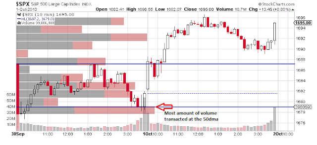
What I found interesting was the recent price action around the 1687.2 level that I've been rambling on about.  We showed in previous posts how a large amount of volume was transacted there recently.  It was actually the largest amount volume that occurred in the 1684-92 area of supply we mentioned above.  Having said that, below is a 10 min chart of the SPX for the past 2 days.  Notice how price is gapped down right to the 1687 area (1687.26 to be exact) only to finding support at the psychological 50 day moving average (dma) at 1679. What is wonderful about the volume by price chart overlay is the ability to see how much volume is transacted at each price area. Notice how the 50 dma saw the most amount of volume transacted as it was forming a double bottom.  That was obviously demand coming into the market.  So what is the point?  The point is that if gaps are really a result of the battle of supply and demand then it would make sense that the battle begins at an area of high volume just like the 1687.2 area.  The second point is that gapping price to the 1687.2 level would have definitely triggered a sell off to a certain degree since we concluded this was a previous area of supply.  Which is why I believe the weak hands holding at this level were shaken out of their positions only to see price find support at the 50dma and rally.  Who said that market is an honest place to make a buck anyways?


Today's market action was bullish as prices closed near the highs of the day. on decent volume.   However, the bullish bias was a result of Monday's trading.  If we look at the following daily chart of the SPX you can see how price fell below the 50 dma (I think they call that running stops) only to recover to close slight above the middle of the price range on increased volume.    The next couple of days should be interesting as the volume profile of the market continues to develop and we can look for the next logical support and resistance area using our point and figure charts and of course volume.

Thanks for reading.